A new site for the State of Victoria, Australia
Opportunity: the citizen engagement team of the state of Victoria wanted to update vic.gov.au.
Solution: a prototype based on data about what government services citizens use most.
Research
We began by gathering all the available usage data from the site. We poured over analytics and deep research from previously conducted interviews.
Then we reviewed other similar site updates, like New Zealand’s new site. We posted our favorite redesigns for inspiration. We also printed out the top site search terms and cut them into strips. We set them on top of cabinets in the hall, that way the whole team could glance at common searches and create new category clusters as they passed by during the day.
We held a card sort to better understand how citizens group government information and which terms are unfamiliar to them. We paired the in-person card sort with a larger online sort to get more accurate data. Spoiler: nobody knows what a ‘hansard’ means. The biggest challenge was how to make the wealth of government information intuitive and easy to access.
Design Sprint
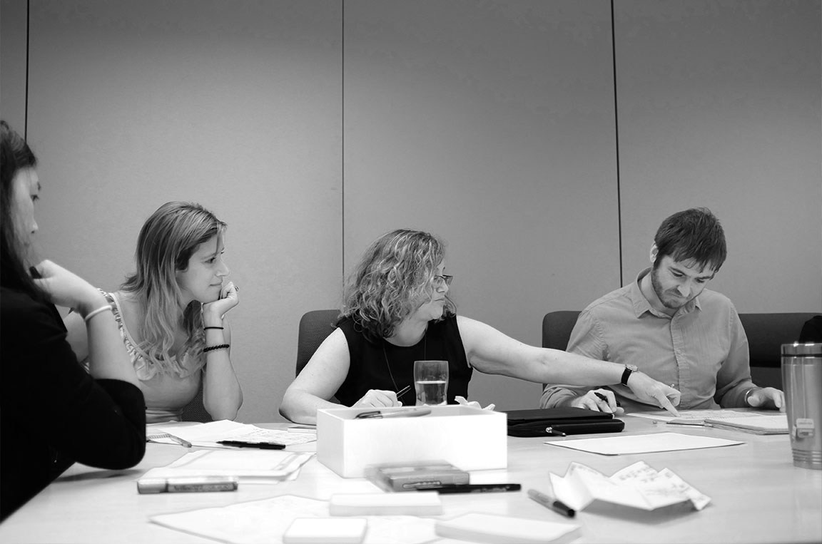
I guided the group through a Google design sprint to quickly generate ideas. Everyone sketched, used post-its to capture ideas, and participated in design critiques.
Prototype
The prototype did not take into account branding or identity, because time was short.
The prototype was a great start. We did a lot in six weeks, but my biggest contribution was sharing a new way to work (iteratively and with constant testing) with my government partners.


After the group design sessions, I synthesized the ideas into a prototype. Then we immediately started user tests of the interface to inform design iterations. One of the first tests was the placement of the search field location. The search field in the middle of the page was found seconds faster than the search field in the upper right. These tests were run online with usability hub.